Google’s iconic “G” logo is one of the most recognized visual identities in the world. Over the years, the logo has undergone several changes, some subtle, others transformative, to reflect the company’s growth, graphic design trends, and ever-evolving mission.
As of today, the Google logo is not only a brand mark, but also a symbol for accessibility, innovation, and digital simplicity. Each redesign has reflected shifts in technology, user behaviour, and the broader landscape of design.
Whether through a change in typeface, color refinement, or interactive animations, the logo has remained familiar while evolving to stay relevant in a fast-changing digital world. Tracing its visual journey reveals not only the story of a company but also the broader trends that have shaped the internet age.
Google Logo Timeline by Year
The history of Google’s logo transformation is a fascinating journey through typographic trends, design minimalism, and branding experimentation.
Each iteration of the logo reflects a moment in the company’s many evolution phases. From its early days with their serif-based logo to the clean modern version seen today, Google has refined its visual presence to stay modern, approachable, and instantly recognizable.
Now let’s take a closer look at the timeline of Google’s iconic logo:
1996 – The Prototype Logo

Before Google was what we know it is today, it was a research project called BackRub, developed by Larry Page and Sergey Brin at Stanford University. The prototype logo from 1996 is now more of a historical part of the brand rather than the current identity.
Main characteristics of the prototype logo are:
-
Very basic and rudimentary.
-
The name “BackRub” was used instead of Google.
-
Utilized a standard typeface with no distinctive design.
1998 – First Official Google Logo

In 1998, Larry Page and Sergey Brin officially launched Google Inc. The duo created the first version of the Google logo using a free graphics program called GIMP.
Despite its appearance being on the more amateur side, this logo laid the groundwork for the color scheme and personality that would continue to refine over time.
Main features include:
-
Exclamation mark at the end (inspired by Yahoo!).
-
Bright, primary colors (blue, red, yellow, green).
-
Serif font that was somewhat playful.
1999–2010 – Ruth Kedar’s Redesign
In 1999, designer Ruth Kedar was brought in to create a more professional identity for Google’s brand. Her redesign remained in use for over a decade.
Ruth Kedar’s redesign was the first logo that truly solidified Google’s identity. It was recognizable and remained largely the same until 2010.
Key characteristics of this logo are:
-
Used the Catull typeface, known for its distinctive serifs.
-
More refined color palette.
-
Dropped the exclamation mark.
-
Cleaned up spacing and letter alignment.
2010–2013 – Flattening Begins

In 2010, Google began making some small adjustments in order to modernize its logo in line with the latest digital design trends.
These adjustments were part of a larger trend across the web toward flat design, aiming for simplicity and clarity on various screen types.
Updates during this time include:
-
Reduced shadowing and beveling.
-
Brighter colors for a more vibrant feel.
-
Minor adjustments in kerning (spacing between letters).
2015 – A Modern Identity
On September 1, 2015, Google made its most significant logo change in years. This was the birth of the current Google logo.
The change coincided with a broader corporate restructuring under the new parent company, Alphabet Inc.
New features are:
-
A custom sans-serif typeface called Product Sans.
-
All shadowing and 3D effects removed.
-
Maintains the original four-color scheme.
-
Cleaner, more modern look for digital platforms.
Animated Logos & Dynamic Identity

With the advancements in technology, Google’s logo evolved beyond static images. Animated logos and interactive elements have become common on Google’s homepage, especially as part of Google Doodles.
Some of the technological adaptations include:
-
Animated transitions, such as morphing into a microphone icon on voice search.
-
Responsive design for various devices and screen sizes.
-
Use of micro-interactions to enhance UX.
|
Year |
Typeface |
Colors Used |
Design Style |
|
1996 |
Default serif |
Red, yellow |
Basic prototype |
|
1998 |
Serif (GIMP) |
Blue, red, yellow, green |
Playful, exclamation |
|
1999–2010 |
Catull (serif) |
Refined version of 1998 colors |
Classic, detailed |
|
2010–2013 |
Catull (adjusted) |
Brighter colors, flatter tones |
Semi-flat design |
|
2015–present |
Product Sans |
Same 4 colors, slightly brighter |
Flat, modern, responsive |
Variants of the Google Logo
Google’s logo is not limited to a single design. Over time, it has been adapted into various formats to celebrate global events, enhance user experience, and offer regional personalization.
These special adaptations help Google stay culturally relevant and visually engaging, reflecting the diversity of its users and the extent of its global reach.
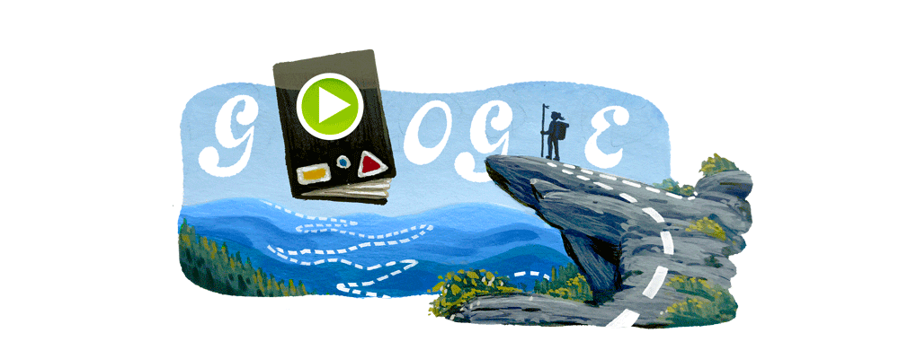
Google Doodles
Google Doodles are temporary modificatiıns of Google’s logo that celebrate holidays, anniversaries, and notable figures.
Google Doodles are often animated or interactive, tailored to specific regions or global audiences, and created by a professional team of illustrators and engineers.
Some of the most memorable examples include:
-
Halloween interactive games.
-
Celebrations of scientists, artists, and activists.
-
Commemorative dates such as Lunar New Year, Earth Day.
Holiday and Regional Variants
Google creates custom logos for different parts of the world in order to celebrate local holidays and cultural moments. These variants help Google connect with global audiences on a more personal level.
For example:
-
Diwali-themed logos in India.
-
Bastille Day doodles in France.
-
Ramadan and Eid greetings in the Middle East.
Google’s Animated and Interactive Logos
In recent years, some of Google’s alternative logos have not only been celebratory but also interactive. These interactions help drive user engagement while showcasing Google’s technological prowess.
These features include:
-
Embedded games, such as Pac-Man doodle.
-
Dynamic animations, such as bouncing balls.
-
AR/VR elements in special editions.
Why Google Keeps Changing Its Logo
For any brand, changing a logo is an important decision, especially one as globally known and visible as Google. So, why has the company made so many changes over the years?
More than being about aesthetics, each redesign aims to reflect shifts in technology, user behaviour, and branding strategy. Each redesign aligns with Google’s evolving mission and helps the company maintain a fresh, modern, and inclusive image in a rapidly changing digital landscape.
Brand Identity Evolution
Google’s mission has expanded far beyond a search engine. As its services like Gmail, YouTube, and Android grew, its brand needed to reflect a broader digital ecosystem.
Main reasons for the evolution:
-
To signal innovation and progress.
-
To better represent the company’s expanded mission.
-
To keep the brand visually aligned with contemporary aesthetics.
Responsive Design
Modern design needs to work across a variety of devices, whether it is a smartwatch or a 4K TV. Google’s flat and simple logo ensures it remains clear and recognizable everywhere.
Recently embraced design principles are:
-
Scalability.
-
Readability on small screens.
-
Simplicity and elegance.
Cultural and Global Resonance
As a company operating globally, Google adapts its logo to reflect local values, milestones, and celebrations. This localization helps foster stronger connections with users worldwide.
Benefits include:
-
Builds emotional connections.
-
Encourages user loyalty.
-
Reflects Google’s commitment to inclusivity and diversity.
Frequently Asked Questions

What does the Google logo symbolize?
The Google logo symbolizes simplicity, approachability, and innovation. The playful color scheme suggests creativity, while the clean lines reflect efficiency and clarity.
Who designed the original Google logo?
The first official logo was designed by Sergey Brin using GIMP. The more refined version used from 1999 to 2010 was created by Ruth Kedar, a Stanford University professor and designer.
Why are there four colors in the Google logo?
The four colors in the Google logo —blue, red, yellow, and green— were chosen for their visual appeal and to reflect Google’s innovative, unconventional spirit. Blue stands for trust, red for energy, yellow for optimism, and green for creativity. The mix of primary colors with green subtly breaks the pattern, symbolizing Google’s playful and non-traditional approach.
How often has Google changed its logo?
Google has made five major logo updates since 1998, with countless temporary doodles and interactive variations over the years. While the frequency of full redesigns is low, minor tweaks and thematic variations happen almost weekly.
What font does Google use in its logo?
The current font used in the Google logo is Product Sans, a geometric sans-serif typeface developed in-house. It’s optimized for clarity, readability, and modern digital aesthetics.