
| Agency | What they do | People | Location | Website |
|---|---|---|---|---|
| Inpsyde | Germany's largest WordPress Agency | 10 - 49 | Germany | www.inpsyde.com |
| spaceride | Modern digital agency creating digital & branding | 2 - 9 | Germany | spaceride.de |
| Aleph Engineering GmbH | Excellent people creating excellent software. | 50 - 249 | Germany | aleph.engineering/ |
| achso! | Digital Creative Agency | 10 - 49 | Germany | achso.media |
| Squareball Digital | Full stack development, UX/UI and IAM consultancy | 10 - 49 | Germany | squareball.co/ |
| NEVIVE | Digital & Print Design | Freelancer | Germany | www.nevive.com |
Best 15+ Web Design Agencies in Germany
Discover and compare agencies within minutes.
- 40,000+brands
- trust us since 2019
- 500+agencies
- carefully vetted
- 5,000+projects
- successfully completed








Explore List Of Germany's Top Rated Web Design Agencies
6+ agencies in this category
Search services
Search location
Inpsyde
Web Design
Inpsyde is a German WordPress agency specialized in multilingualism, online shops, smooth applications and high performing websites. For its professional work, Inpsyde has already been honored by WordPress and WooCommerce. That’s how Inpsyde became Germany's only verified WordPress VIP Partner and WooExpert Gold Partner.We love WordPress – you love what you’ll getWith in-depth consulting and conception, we develop solutions for all possible applications. These range from simple blogs and business sites, and online shops to high-end database applications, multilingual portals and intranet solutions. We offer migration and maintenance of existing systems, and raise websites to a high level of performance and security. We love what we do – you’ll love how we support you As we grew out of the German WordPress community more than 10 years ago, we commit ourselves to open source and sharing. That’s why we contribute to WordPress Core regularly – with an effect: Round about 8% of WordPress Core is written by us. With our clients, we work in a fair and partner-like relationship and commit ourselves to your success completely. This might include telling you right up-front where we see potential potholes down the road, and offering you more sustainable solutions than the ones you aimed for. Our services in an overview: Realize Enterprise CMS Solutions Custom APIs and API integrations Big Data Migration (API/CLI driven) Customized Plugin Development ERP Integration ElasticSearch UI/UX Design Blockchain Performance Optimization Code Auditing and Reviews Custom Publishing Workflows Continuous Maintenance and Longtime Partnership Read more...
10 - 49members
From$10,000+forWeb Design
Located inGermany
spaceride
Web Design
spaceride is a modern digital agency that provides chatbots, websites & digital branding for ambitious companies who want to digitize their business. Unlike other digital agencies, spaceride achieves this by pursuing our love for design & technology. It's all part of our vision to connect people.
2 - 9members
From$1,000+forWeb Design
Located inGermany
Aleph Engineering GmbH
Web Design
We are Aleph Engineering, excellent people creating excellent software. Start working with us, turn your development ideas into great projects and have lots of fun in the process! We achieve this objective by recruiting the brightest minds and by creating an innovative & inspiring working environment to let them shine even brighter. We understand that only by working together in a team – with trust, respect and humbleness – we can achieve the best possible results. , 0, 0, 0.6); font-family: -apple-system, system-ui, 'system-ui', 'Segoe UI', Roboto, 'Helvetica Neue', 'Fira Sans', Ubuntu, Oxygen, 'Oxygen Sans', Cantarell, 'Droid Sans', 'Apple Color Emoji', 'Segoe UI Emoji', 'Segoe UI Emoji', 'Segoe UI Symbol', 'Lucida Grande', Helvetica, Arial, sans-serif; white-space: pre-line; background-color: #ffffff;">We cooperate from Cuba as well as from different countries across Europe. This challenges us to act globally in every conceivable way and makes us experts in international collaboration. Hence, we are able to provide the utmost benefit from a globalized world to our customers. Our solutions comprise: Custom Software Development, Enterprise Software Development, Web Application Development, Mobile Application Development, UI/UX Design, Brand Design, Software Prototyping, Quality Assurance / Testing, API Development And Integration, and Legacy Software ModernizationRead more...
50 - 249members
From$25,000+forWeb Design
Located inGermany
Get offers from experienced agencies tailored to your goals.
achso!
Web Design
now it makes sense. keep it boutique. achso! is a Berlin-based boutique, full-service digital marketing and visual design agency specialising in gastronomy, retail and tech. We believe boutique is best – that way we can give our clients our full attention. creative problem solvers. Our team of experienced, multi-disciplinary industry experts guide you through every step of the production chain - from research to strategy planning, concepting to art direction, content creation and long-term campaign management. We’ll find the right solution for you. relationships, not client lists. We take on the projects that excite us, that challenge us and that we can 100% get behind and support into the future. That’s how we do our best work. We see your goals as our goals, your successes as our successes and plan for long-term partnerships. Think of us as an extension of your team. how can we help? Looking for a creative design, marketing, communications and visual production agency to help your business or brand reach new heights? We build bespoke product and service packages with transparent communication and pricing structures. If you like what you see, great - let’s get to work.
10 - 49members
From$5,000+forWeb Design
Located inGermany
Squareball Digital
Web Design
Squareball is a development and design team from Berlin. We're full service - defining, designing and developing custom products, services and apps. This is achieved using only leading modern technologies, the best cloud based services and focusing on integration with leading IAM platforms.We work with clients big and small, so whether it’s a website, app or bespoke product we focus our approach on four main areas: Software development, IAM consultancy, product management and UX/UI.We’re here to get your idea off the ground, launch and grow your platform and help make the right strategic and technical decisions.We love to be involved with projects that motivate us and this is reflected in our flexible engagement models.SERVICESDevelopmentWebsites and Mobile appsIdentity and Access Management solutionsPlatform DevelopmentSolution architectureCloud Infrastructure and Dev OpsTechnical Lead servicesIAM ConsultancyIndependent experts across leading Identity solutionsOfficial partners with Okta and Auth0Okta Certified Developer and Administrator resourcesIdentity strategy including licensing, implementation and roadmapProduct ManagementProduct strategy and discoveryUser research and analysisUser story mappingTechnical leadership Solution architectureUX/UIUI designUser journeysBrand identity PrototypingDesign Sprints and creative workshopsInfographics, animations and illustrations
10 - 49members
From$10,000+forWeb Design
Located inGermany
NEVIVE
Web Design
Gizane, the creative mind behind NEVIVE, is a Berlin-based designer from the Basque Country. Illustrator, print, brand, web designer, fiber artist, and more. Her style is soft & bold. She loves to work with lines, colors, and fonts. But enough about me! What about you? Let’s create, collaborate and work together, I want to hear from you!
Freelancermembers
From$1,000+forWeb Design
Located inGermany
Get offers from experienced agencies tailored to your goals.

Connect. Convert. Grow.
Start your project today without any cost and meet qualified experts who can get the job done. We help you make the best choice, hassle-free.
- Get quotes at lightning speed
- millions in revenue created
Recommended for You
Discover services
Germany Web Design Agencies List (6)
Germany Web Design Agencies Prices
| Web Design Agencies | Prices |
| Inpsyde | $10,000+ |
| spaceride | $1,000+ |
| Aleph Engineering GmbH | $25,000+ |
| achso! | $5,000+ |
| Squareball Digital | $10,000+ |
| NEVIVE | $1,000+ |
Latest Web Design Projects
Discover the latest created projects in Web Design
What Our Clients Are Saying About Edvido

Elif Cetinkaya
Region Manager at Danone Nutricia
Agency Selection
Edvido agency provided us a quality service with incredible speed during our selection process. It's the only address you can choose with trust in this field.

Seda Yimenicioglu
Product Manager at Orzax Pharmaceuticals
SEO
I use Edvido frequently. It reduces processes that would take weeks to a few days. I am also incredibly pleased with the seo agency we work with.

Nazli Acar
Vivoo
Creative Agency
We were looking for an agency that could do business on a global scale. We started working with an amazing creative agency through Edvido.

Gülin Özgen
Marketing Director at Kingston
Business Partnerships
Edvido is a very good platform for companies looking for new business partners. The match was perfect. Thank you Edvido.

Murat Sargin
Board Member at Cardiac Surgery
Social Media
We concluded our association's search for a social media agency in Edvido. We have a great cooperation with the team we work with.
Metin Uysal
Etkin Group
Software
We were looking for the right company to develop our digital product. Thanks to Edvido, we quickly found the software company that best suited our needs and vision. The process was both fast and highly efficient; working with the right team gave our project a strong start.
Sedat Coşkun
Epikplus CEO
Business Partnerships
If you want to grow, becoming an Edvido member is a must.
Blog & Insights
Explore our marketing and software focused content






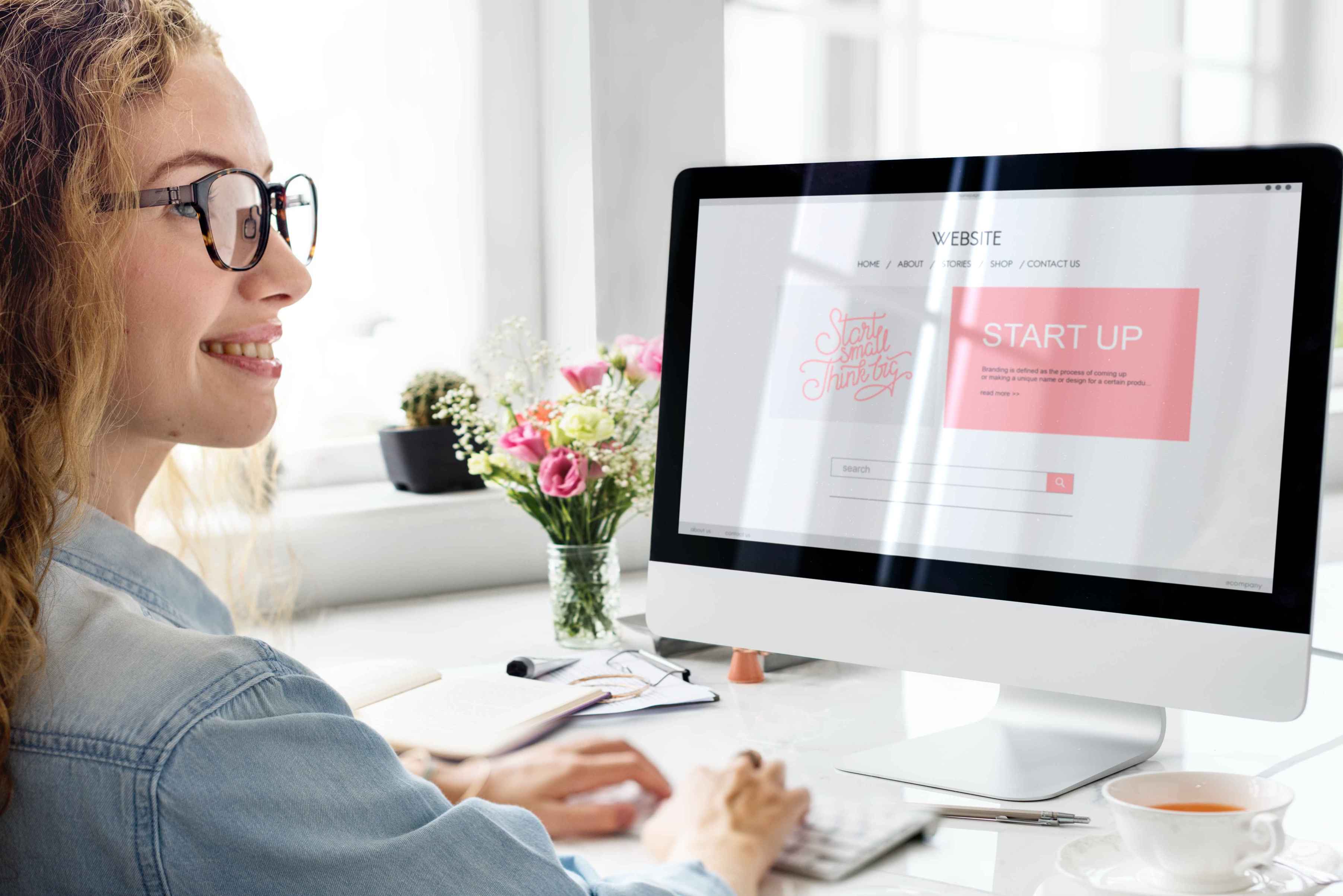



Accessibility has moved from nice to compulsory, and it is a web design decision
Businesses selling to consumers in Germany now sit inside an accessibility regime that applies to digital services, not only to buildings. The practical reference point is WCAG 2.1 at the AA level, and most of what it demands is settled long before anybody writes code. Contrast ratios are chosen when the palette is chosen. Readable body sizes are chosen when the type scale is chosen. Visible focus states, sensible heading order, labelled form fields and a layout that survives enlarged text are all drawn, not patched.
Ask web design candidates how they handle it. The revealing answer describes decisions made during design. A studio that treats accessibility as a testing phase at the end is proposing to deliver something you will pay to redraw.
Contrast and type set the palette, not the other way round
Many brand palettes were built for print and contain at least one colour that fails badly as text on white. The usual improvisation is to keep the colour and hope, which produces buttons nobody can read in daylight and a legal exposure nobody priced.
The better approach is to extend the palette deliberately: keep the brand colour for large elements, and derive a darker companion for text and small interface parts. Ask to see the contrast pairs documented as part of the web design deliverable. Ask the same about type, since a typeface that looks refined at heading size can be genuinely hard to read in a long paragraph, and German compound nouns are long, which punishes tight letter spacing and narrow columns more than English does.
A specification culture is an advantage once you use it
Buyers here tend to want detail before commitment, and studios are used to supplying it. That habit is worth exploiting rather than resenting. A proposal that names the templates, the states, the breakpoints, the rounds of revision and the format of the handover is a proposal you can actually compare against another one.
Insist that the web design scope names page types rather than a page count. Home, category listing, detail, article, form and legal template is a scope. A number of pages is a guess. Insist too that the definition of done is written down for each stage, because ambiguity is what turns a fixed price into an argument, and this is a market where the argument tends to become formal quickly.
Legally required pages are part of the design, not an afterthought
Imprint and privacy pages are obligatory, consent interfaces are scrutinised, and all three are usually handed to whoever is left at the end of the project. It shows. Long unformatted text, tiny type, a consent banner that fights the layout it covers, and a rejection option hidden behind a second click.
Put these in the scope from the beginning. A designed long document template with real hierarchy makes legal text readable. A consent interface drawn by the same person who drew the pages behaves like part of the site rather than an intrusion, and giving refusal the same visual weight as acceptance is both safer and less irritating. Good web design here includes the parts of the site that exist because the law says so.
Content in more than one language changes the grid
If the site carries German and English, the web design has to hold both. Translated headings change length substantially, navigation labels that fit comfortably in one language wrap in the other, and a design approved against only one version will break on the day the second arrives.
Ask for key templates to be shown in both languages before sign off, with the longest realistic labels rather than convenient short ones. Agree how language switching is presented and whether every page exists in both. This costs almost nothing while the work is being drawn and is genuinely disruptive afterwards.
Questions that separate the serious candidates
- How do you verify contrast and focus states before handover?
- Which of your live projects would you be happy to have audited for accessibility?
- What exactly do we receive at the end, in which file formats?
- How are the legal pages and the consent interface handled in your scope?
- Who is liable if the delivered design fails an accessibility check?
The second question is the one that produces honest conversations. Every studio claims to care. Far fewer will name a live project and invite the test.
Comparing web design agencies in Germany without guessing
Three candidates, one written brief, identical questions. Ask each for a fixed structure: reading of the problem, proposed deliverables, assumptions, timeline dependencies and how changes are priced. Compare the assumptions first, since that section shows who understood the brief and who skimmed it.
Then look at live sites rather than portfolio images. Enlarge the text, navigate with the keyboard alone, and check whether the design still functions. It is a quick test, it takes a few minutes per candidate, and it reliably separates studios that talk about standards from studios that meet them.
Our directory lists verified web design agencies with profiles you can read before making contact, together with related suppliers such as animation studios and digital marketing agencies. When the shortlist is ready, request matched proposals so every studio answers the same brief. Where implementation is contracted separately, begin with the listed web development companies or the software companies covering bespoke systems.